PORTFOLIO
CONTACT ME
Case Study
UX Research
Branding
Web Design
Prototype
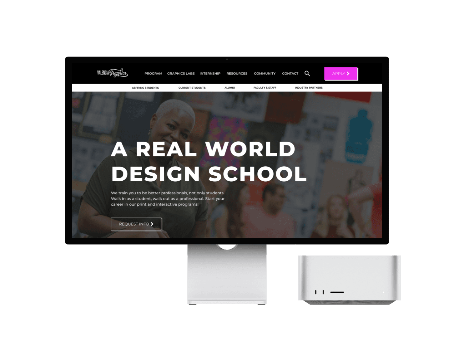
Valencia Graphics’ program has had problems with their previous website. This website, has not been updated in years, making it hard for Valencia to keep students, new enrollments and alumni updated on important information. Because of this, Valencia is in need of a website redesign that enhances the student experience, while keeping them informed.
The Valencia Graphics website has faced a traffic decrease due to a design predicament. Although most of the content appears to be on the site itself, the lack of hierarchy and harmony within its structure makes all the information hard to find. In addition to the previous, the lack of contrast on color palette chosen kills down the enthusiasm and offers no guidance or call to action that persuades users to keep navigating through it
Solution
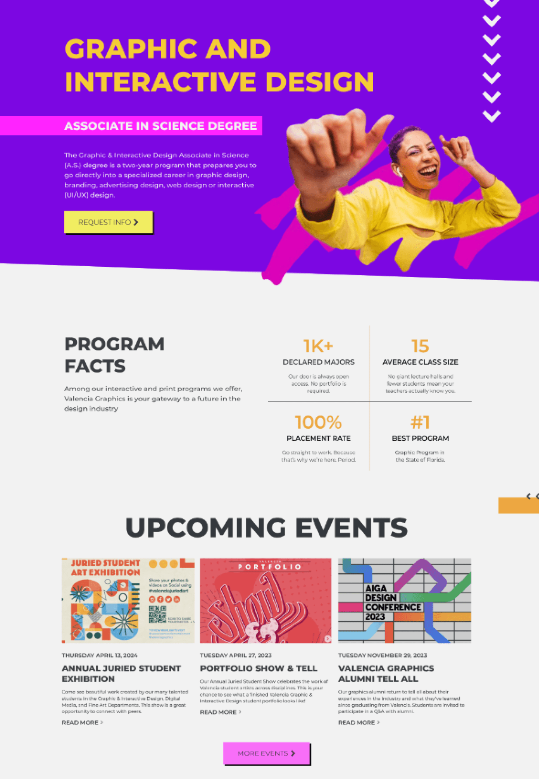
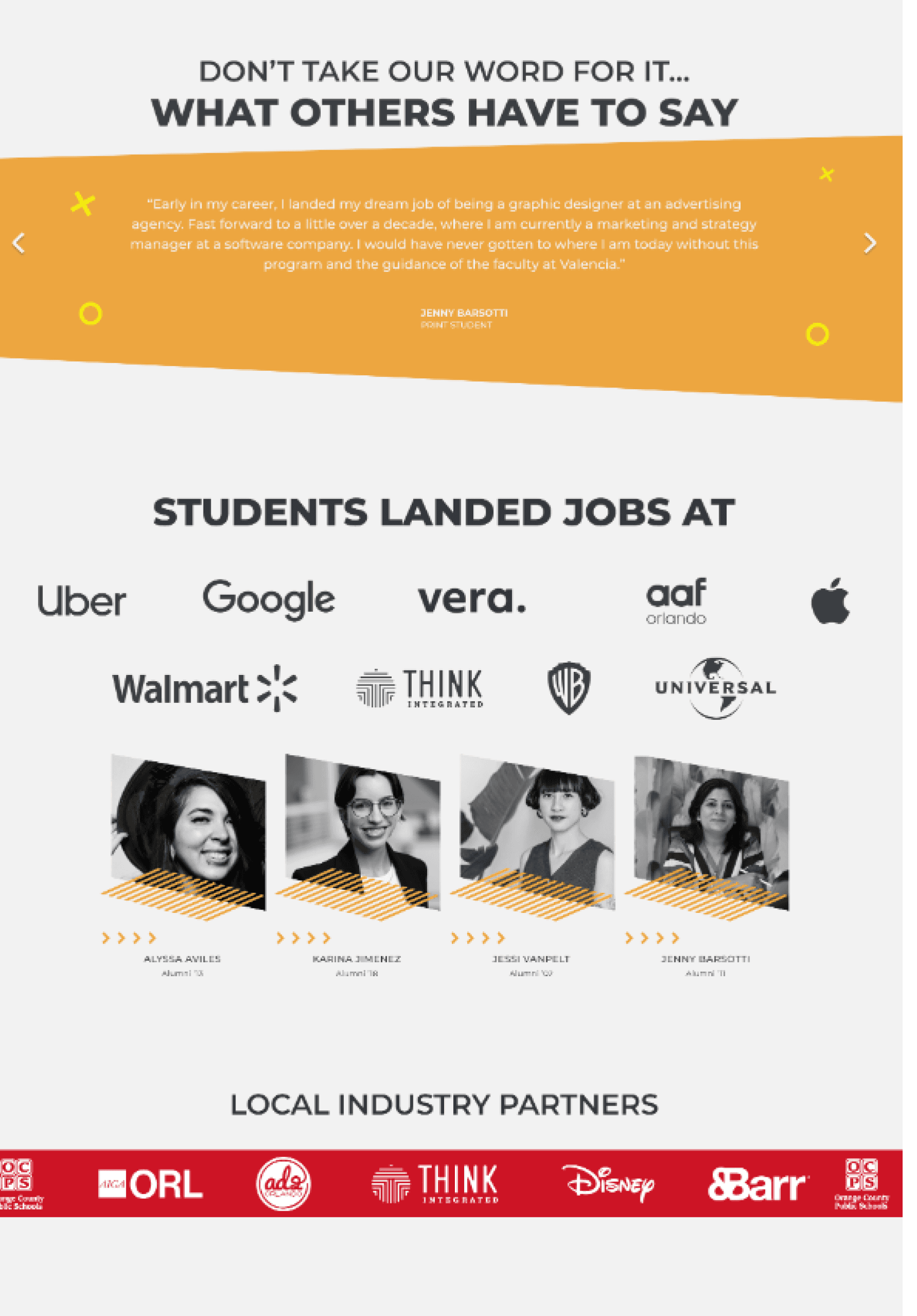
In order to bring the attention of users back, my team and I had to deconstruct its structure and start from zero. Beginning with a slight rebranding, changing both colors and typography, and including instances of interaction. Once all of these were chosen, arranging all pieces of text, images, design elements and miscellaneous media would become more approachable. All culminating on a clean and user-friendly platform for current and future design students to explore and reference.
About Valencia Graphics
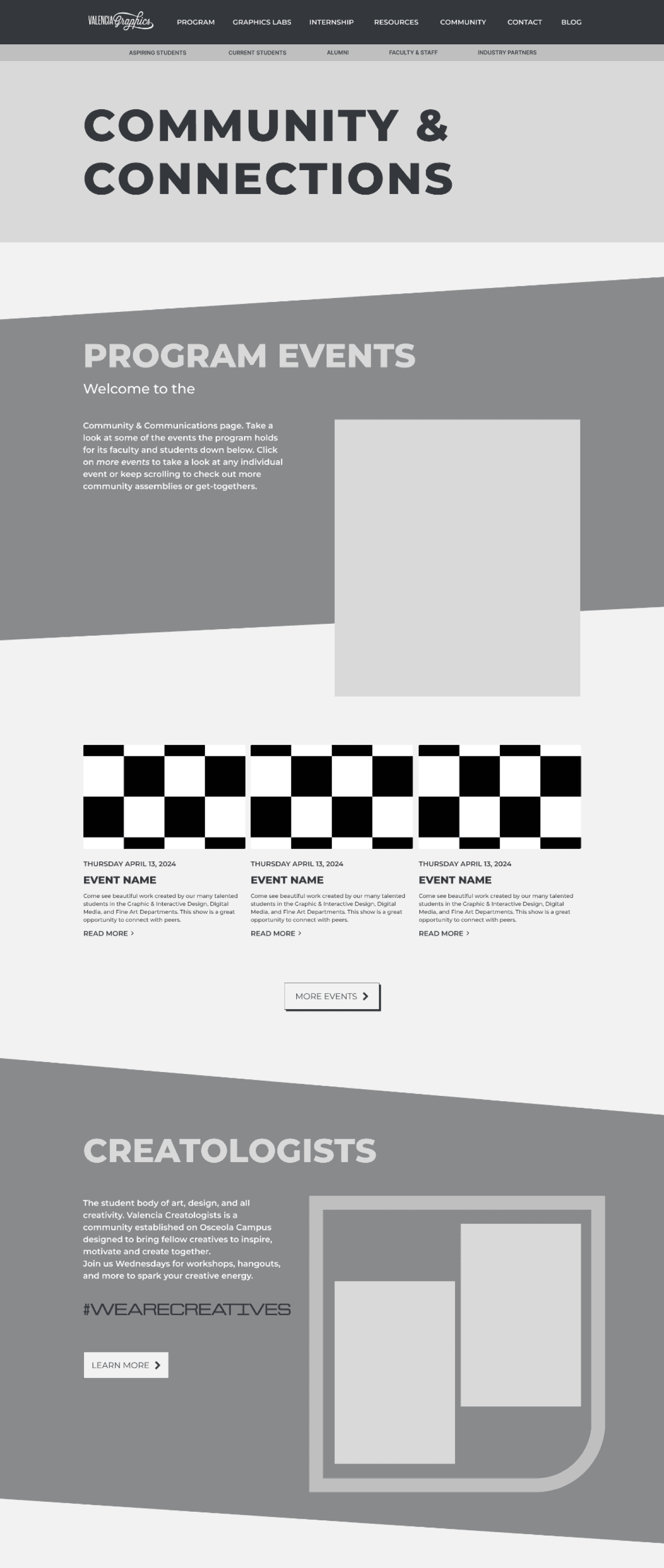
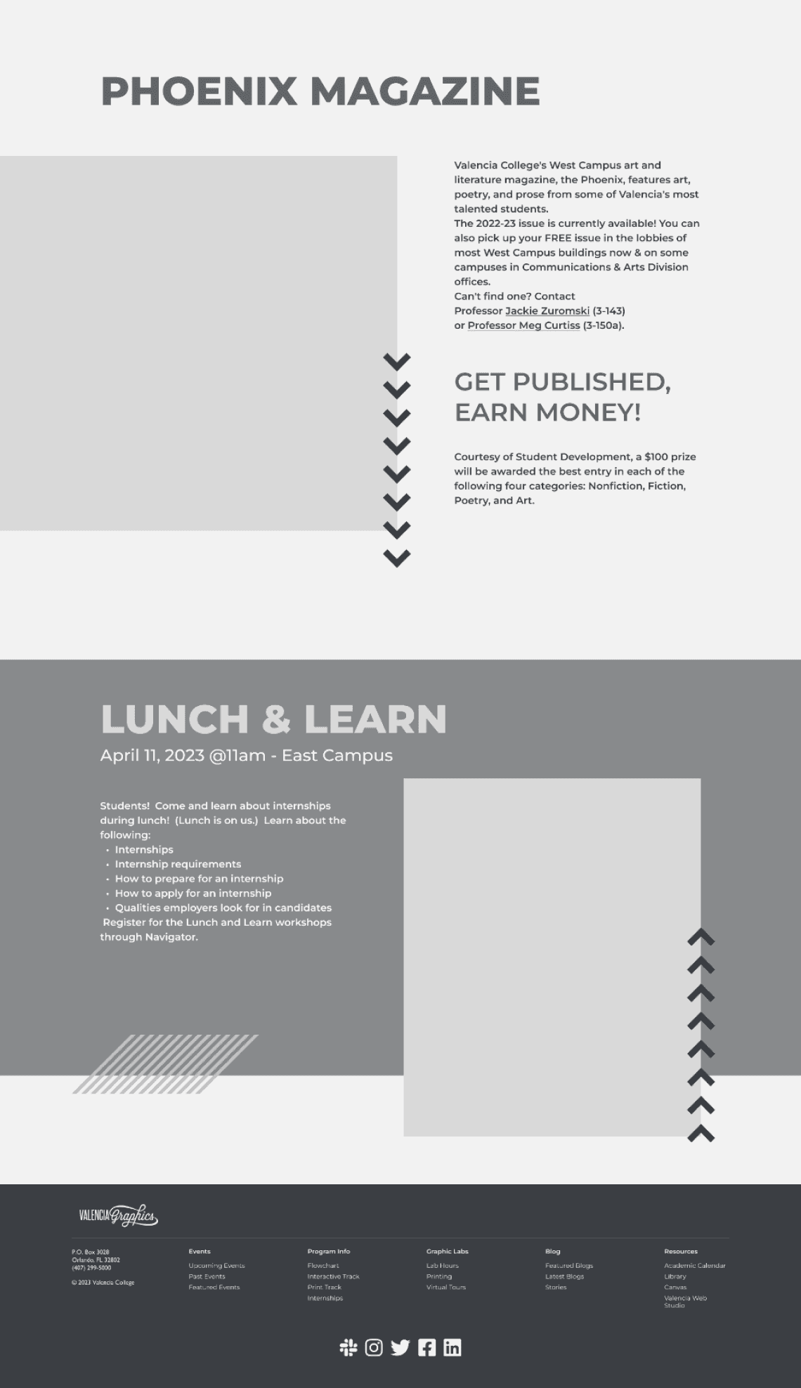
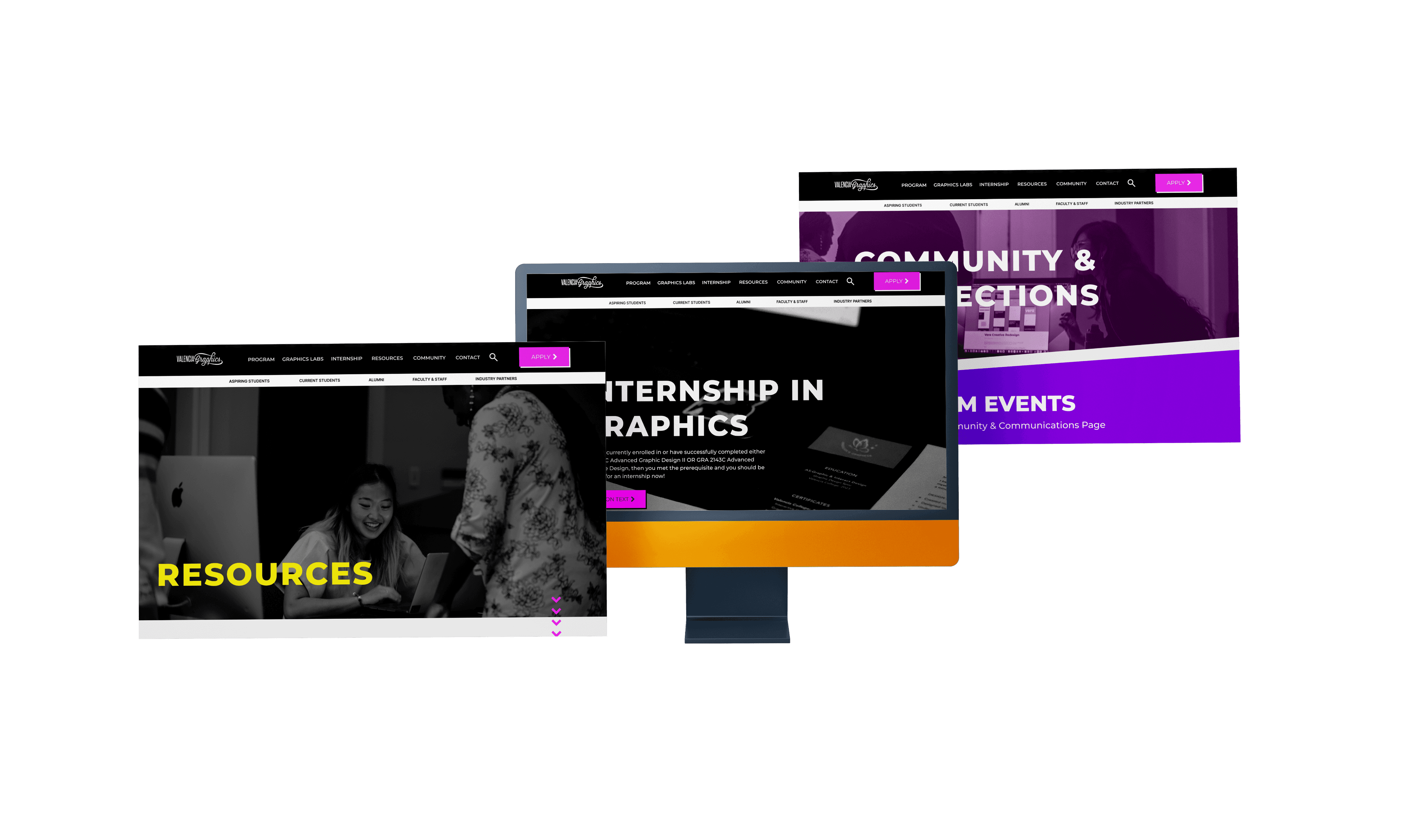
As the person responsible for building wireframes, exploring color variations, and prototyping the website, my role focused in shaping the visual and functional aspects of our project. I crafted wireframes, which served as the blueprint for the website's structure and layout, ensuring intuitive navigation and user-friendly interfaces.
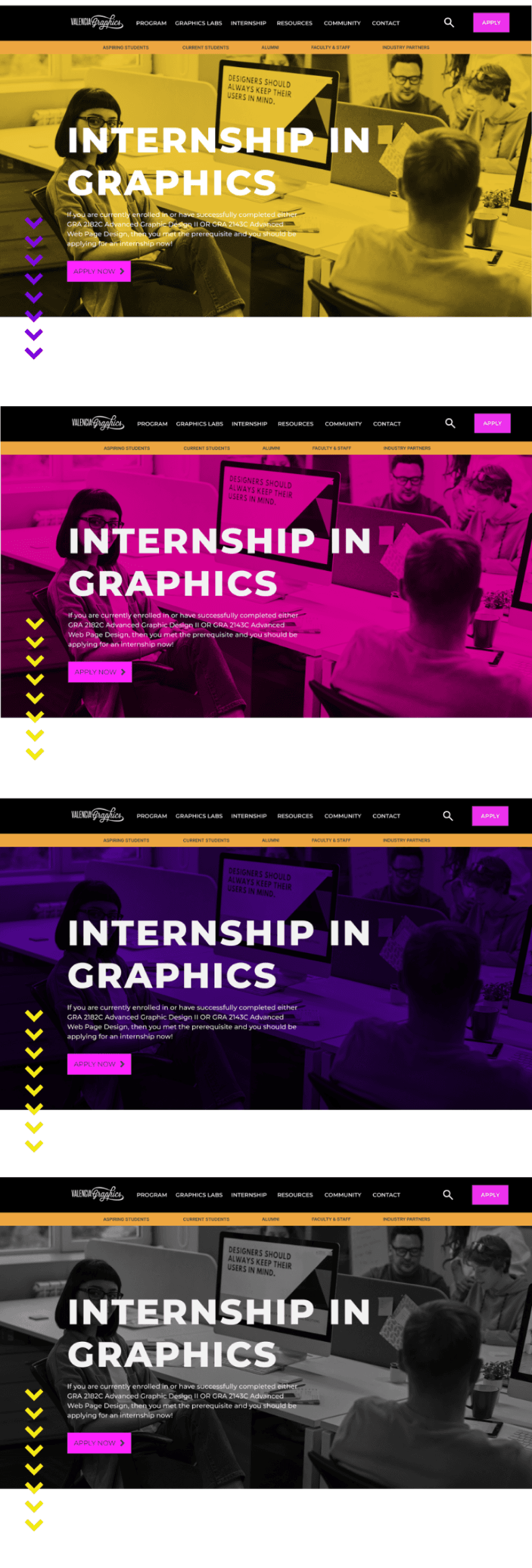
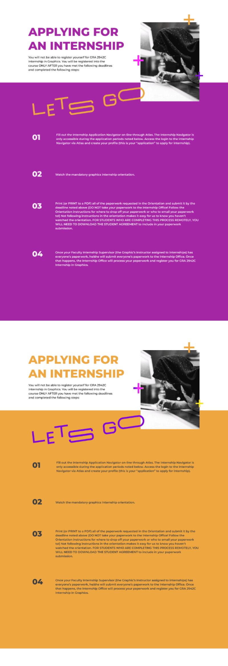
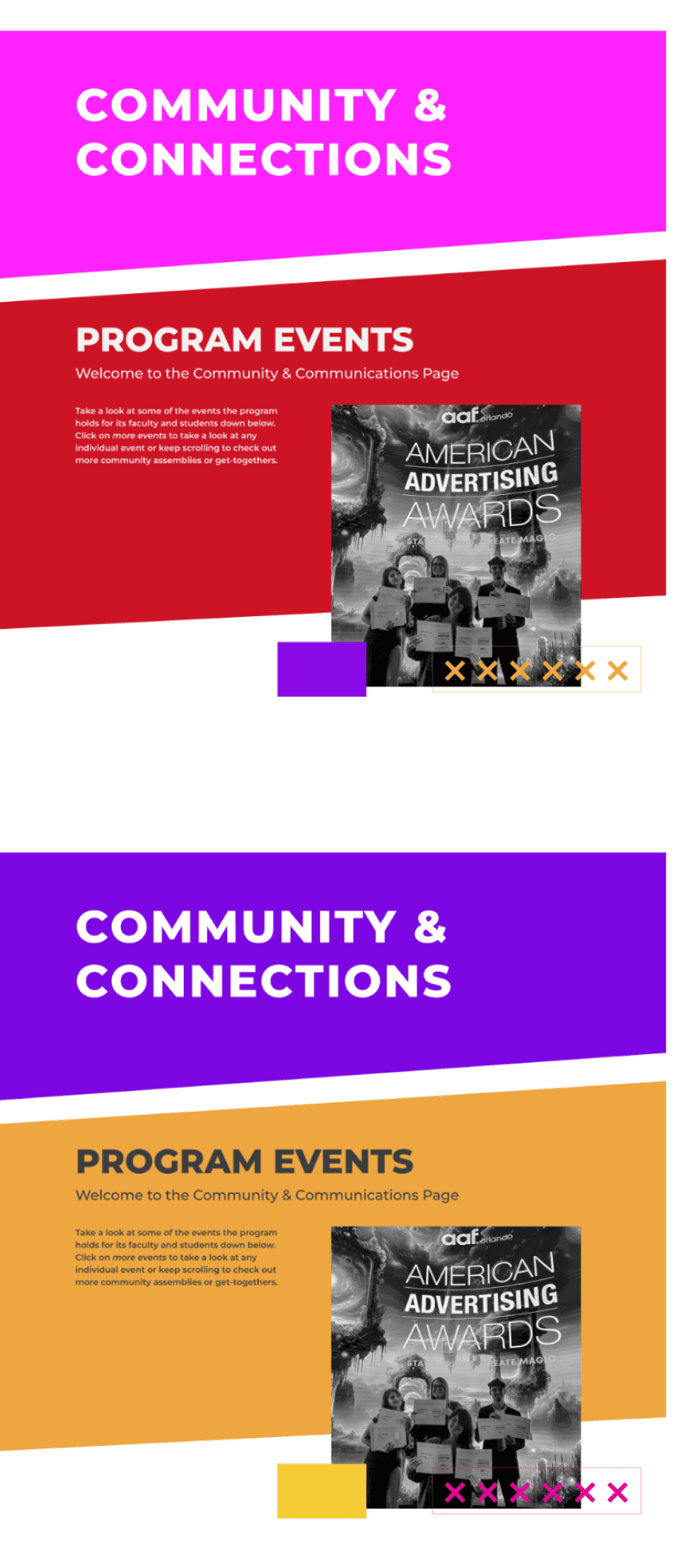
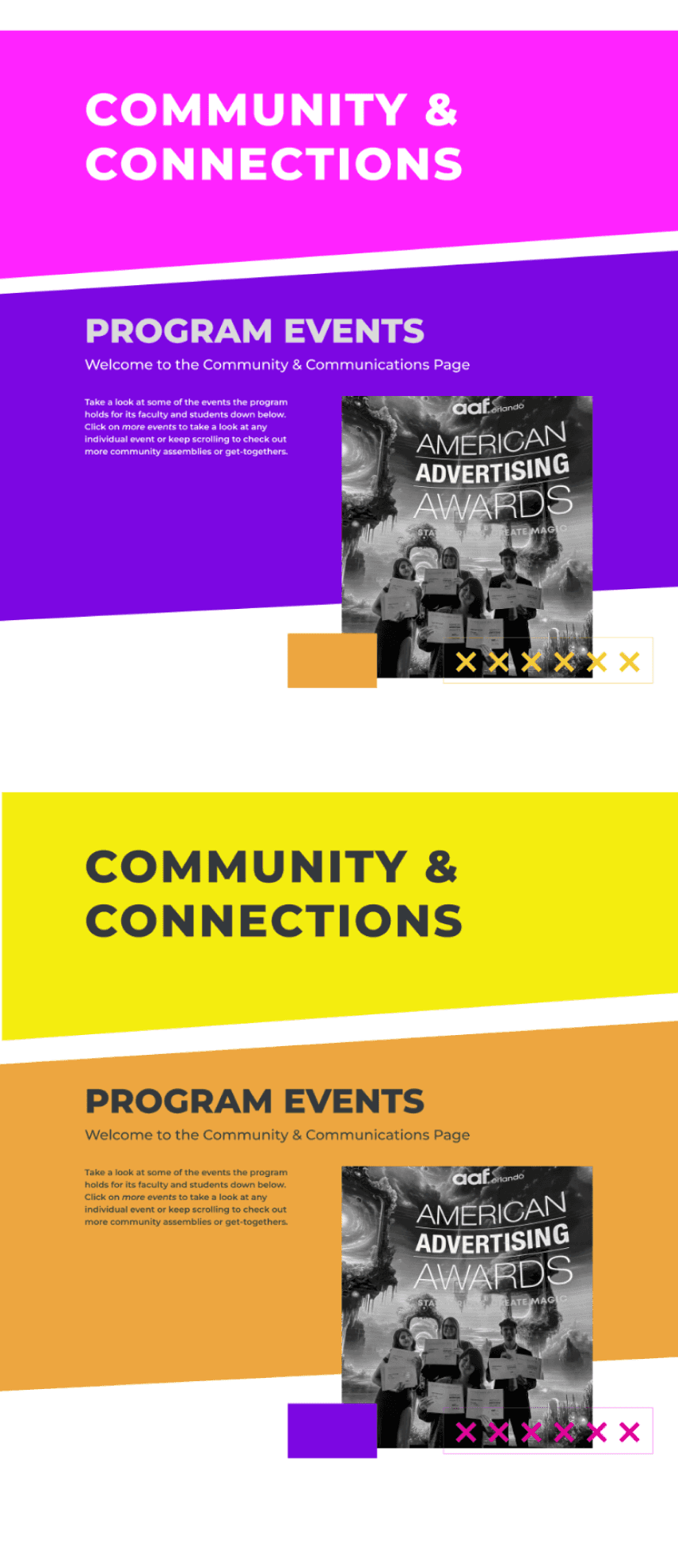
Delving into color variations, I conducted extensive research and experimentation to find the palette that best reflected our college's identity and appealed to our target audience, while also following the respective style guide. This process involved selecting hues that not only enhanced visual appeal but also conveyed the program's creativity and innovation.
I was also involved in creating a functionable prototype for the high fidelity comps in the website. This is where I created interactive mockups to get a better feel of what the website will look and feel when taken to the developing stages.
My Role
Problem Statement
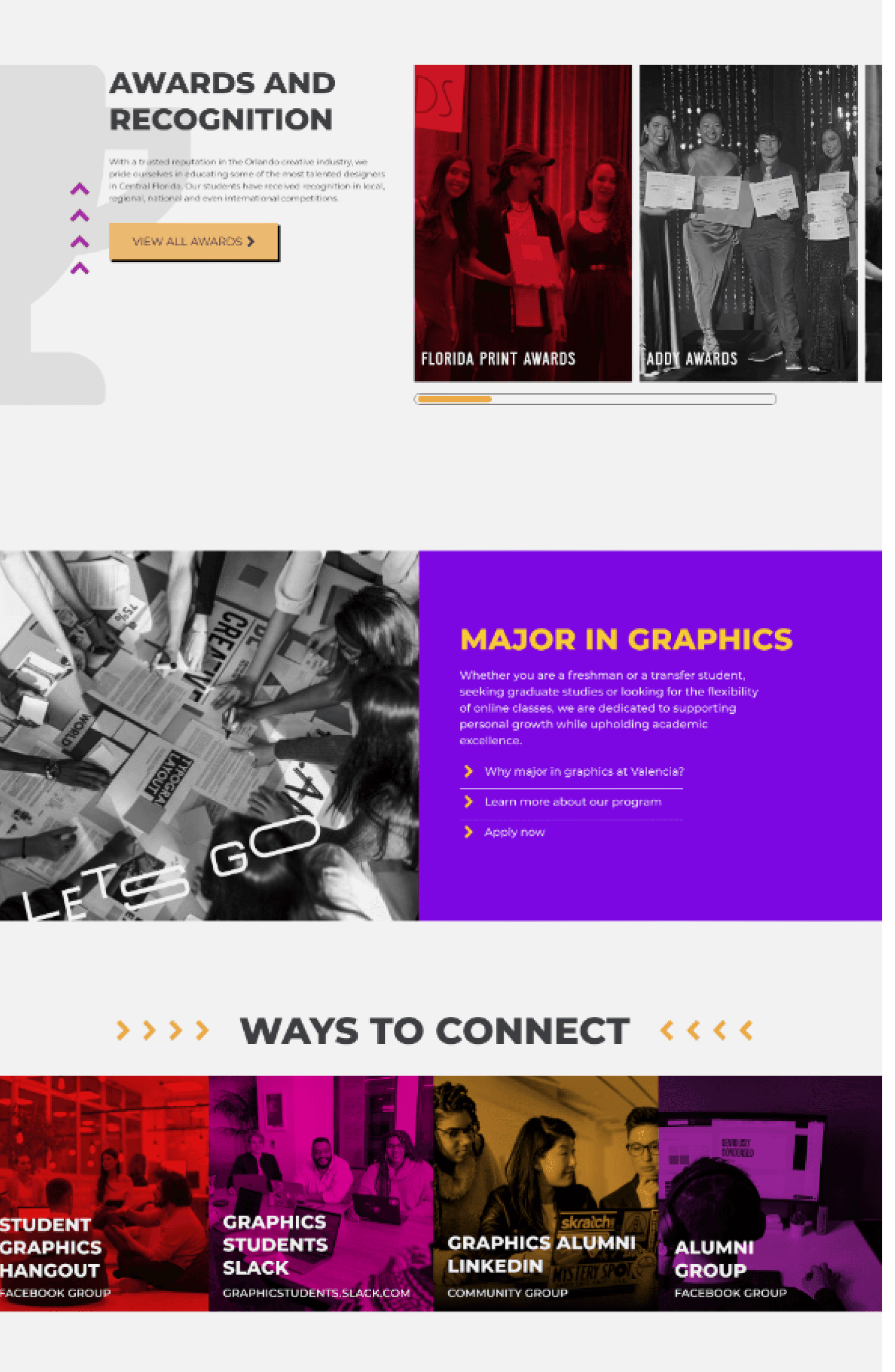
#FF23FF
Color Styles
Typography
Buttons & Icons
Brand Elements
Burg
Heading 128pt
Subheading 64pt
Body 24pt
#F4ED0F
#7C07E2
Montserrat
Button Text
Button Text
Button Text
Button Text
Button Text
Button Text
Button Text
Wireframes
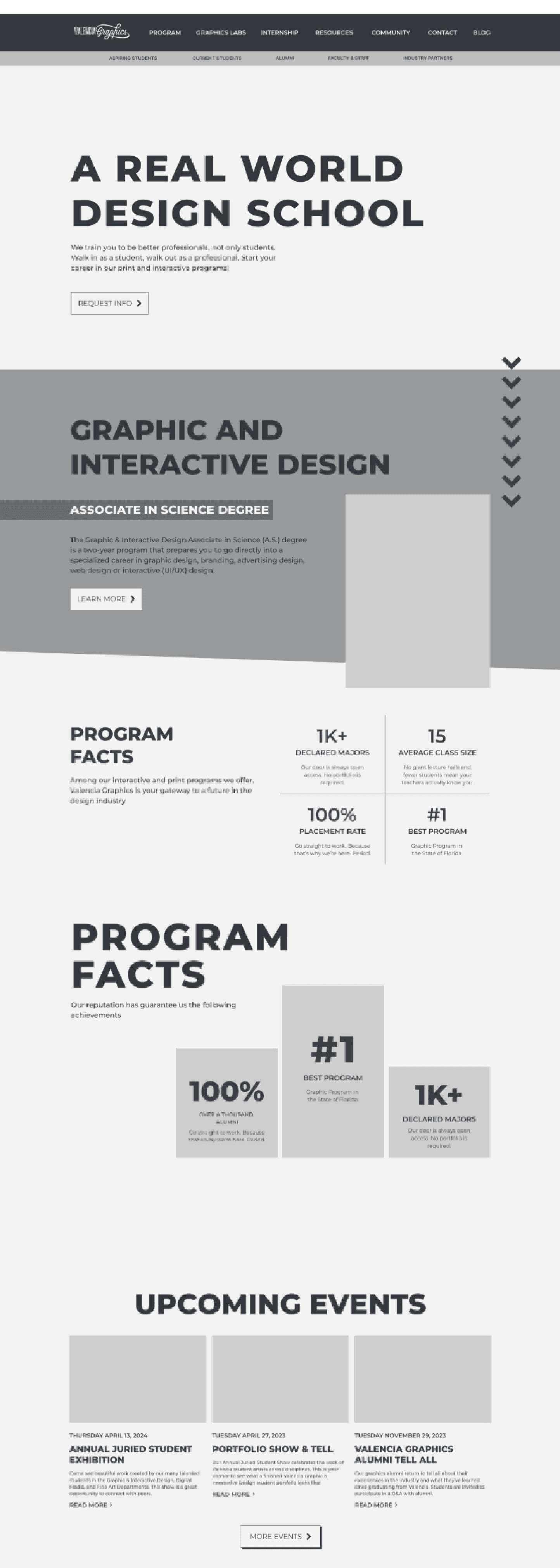

Homepage

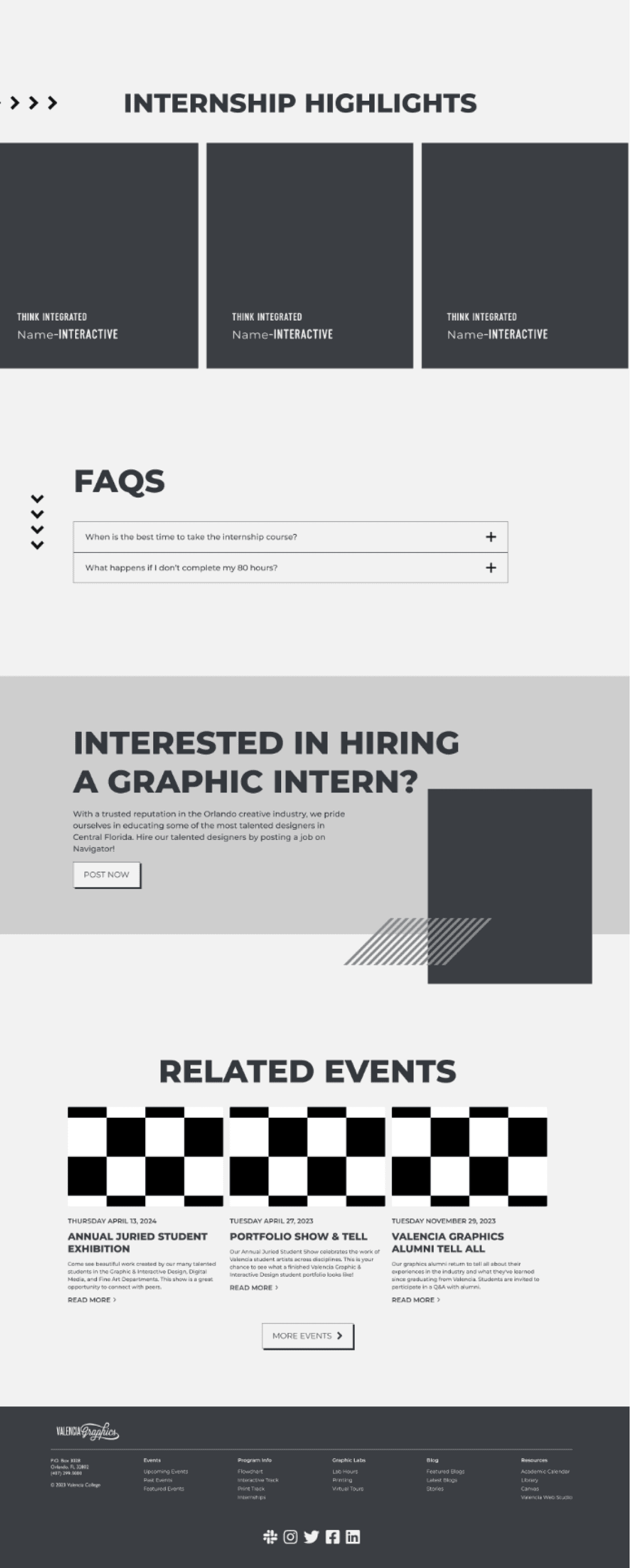
Internship Page
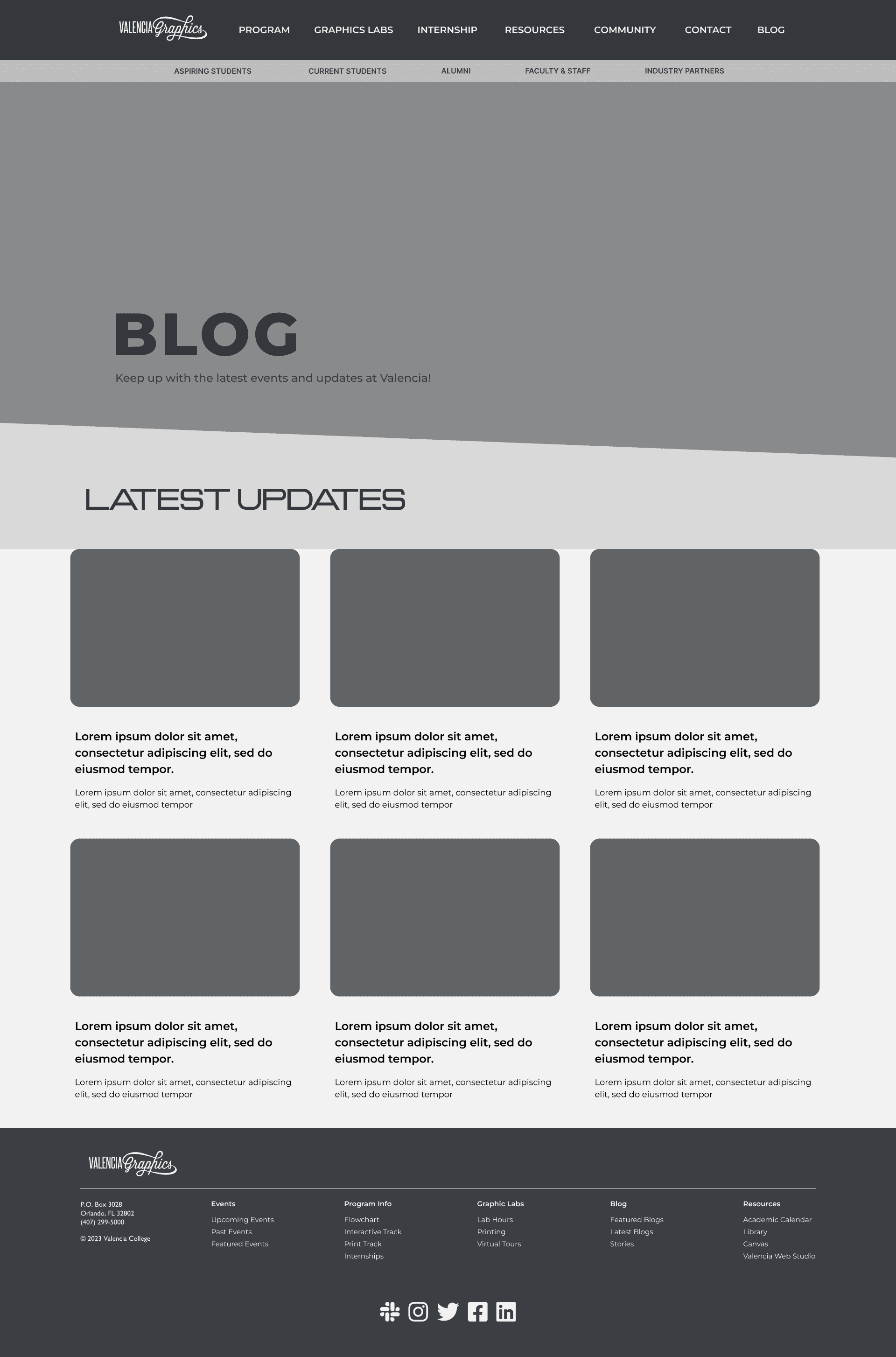
Blog Page
Community Page
Color Variations


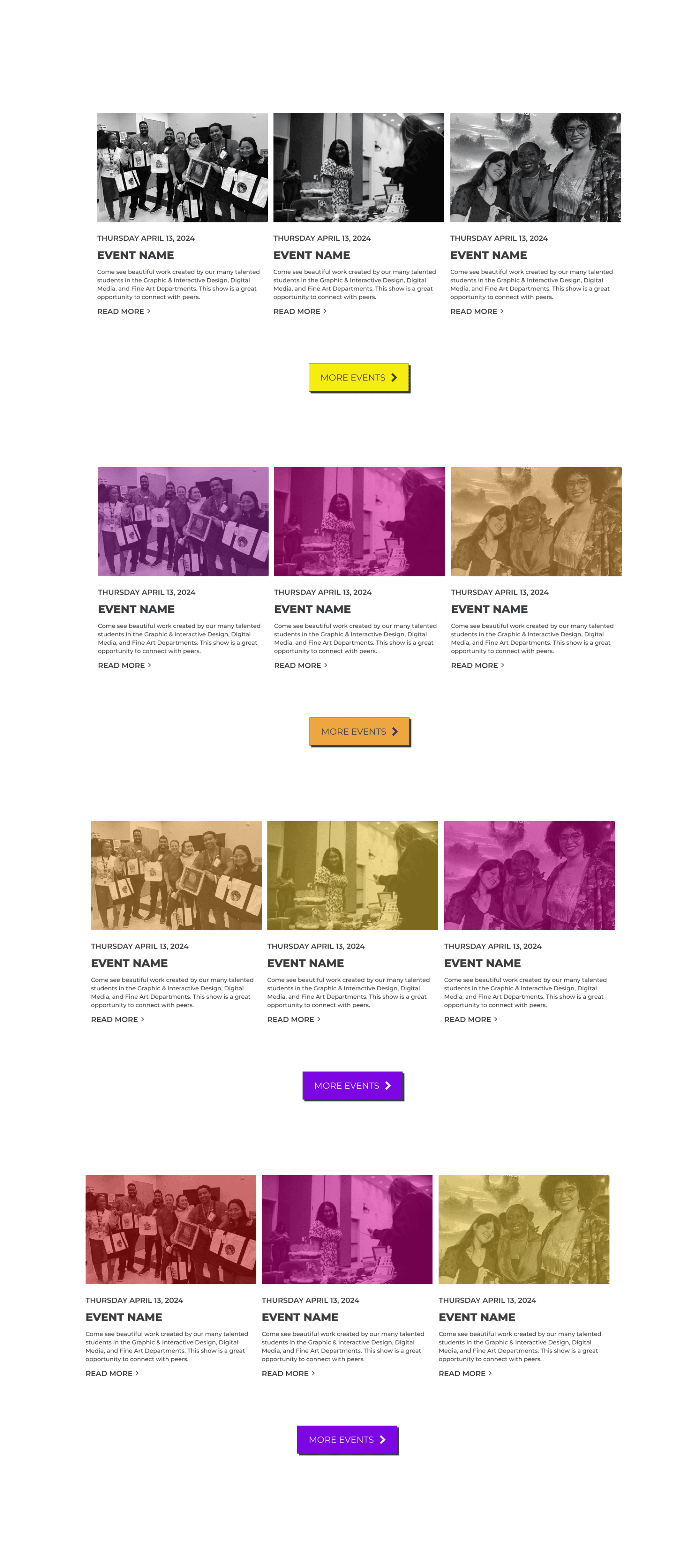
Community Page
Internship Page
Color Variations
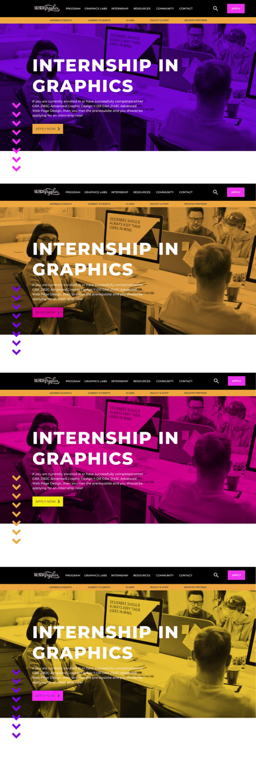




High Fidelity Wireframes
Prototype
Prototype

Branding
Michelle Candurin
2024
MICHELLE
CANDURIN
DESIGNER