Penny Juice
Website
Project Overview
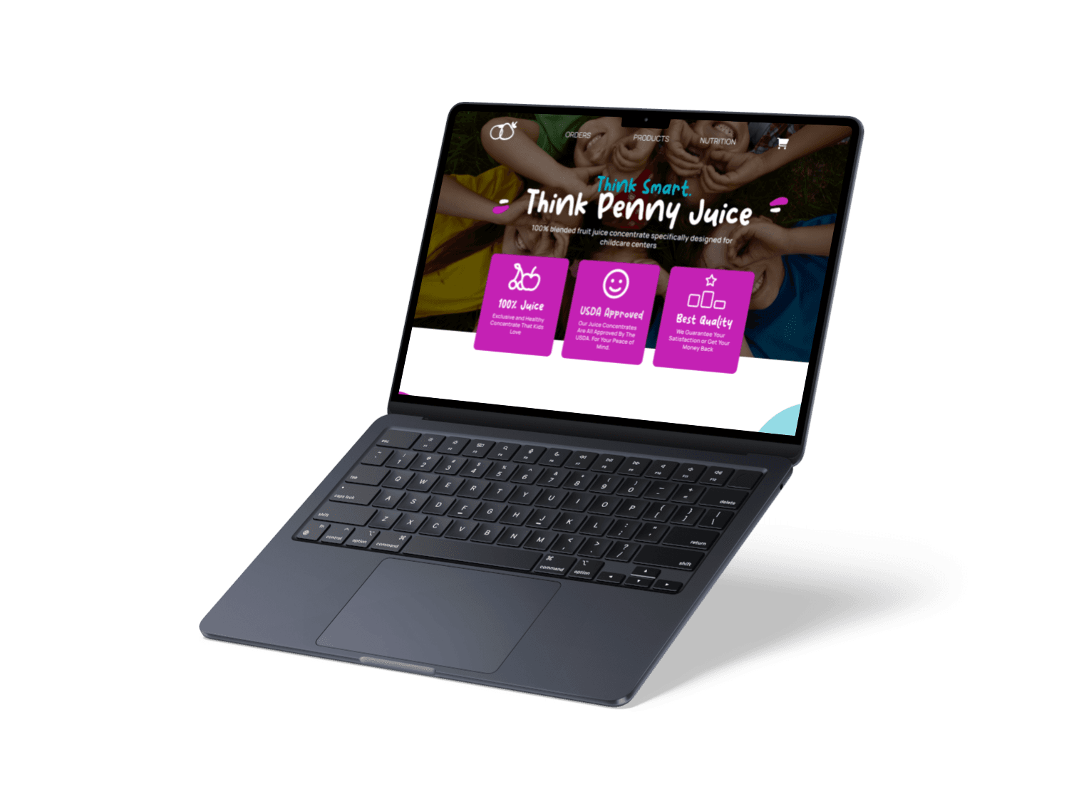
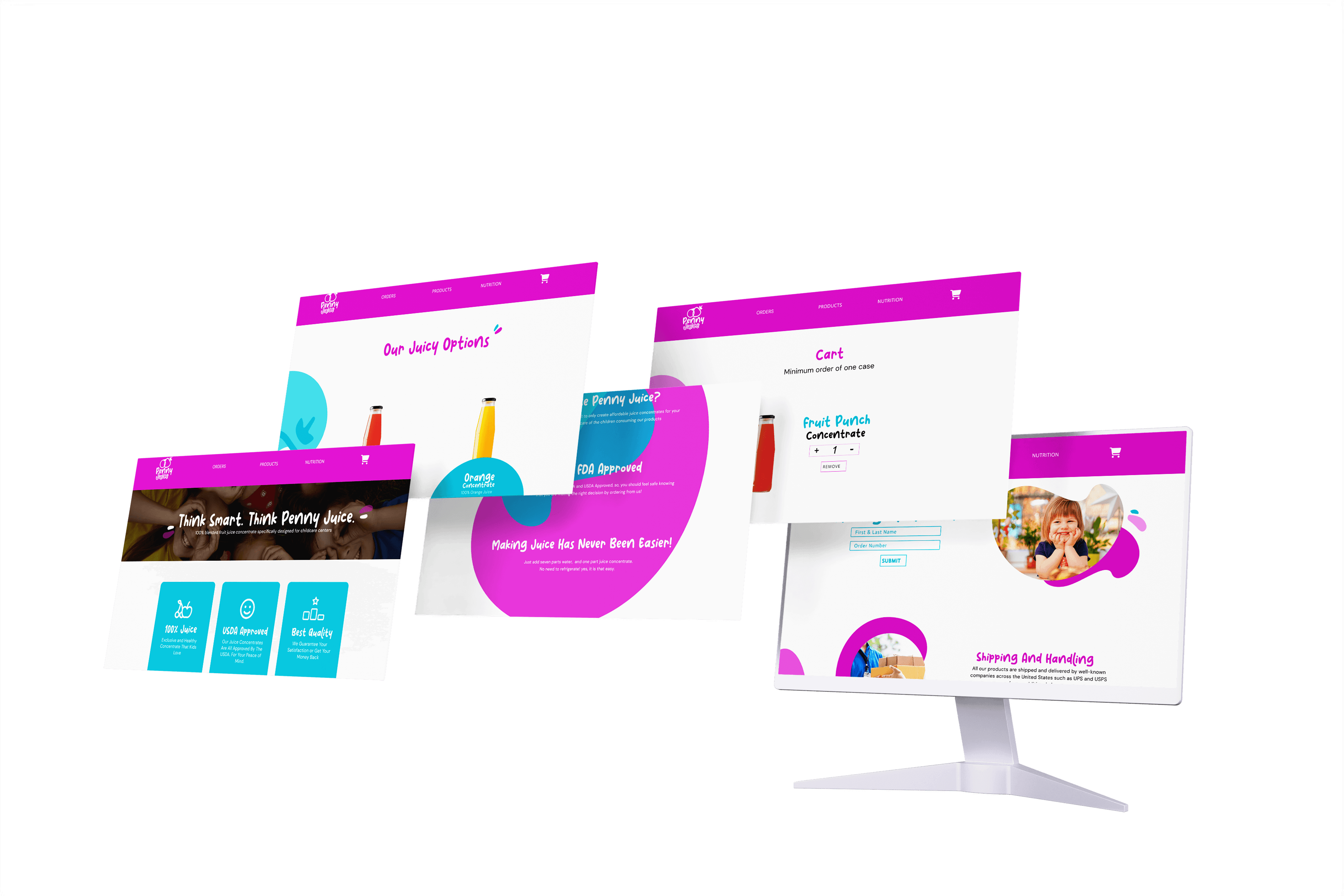
High Fidelity Wireframes
Prototype
Prototype
PORTFOLIO
CONTACT ME
About Penny Juice
Problem Statement
Solution
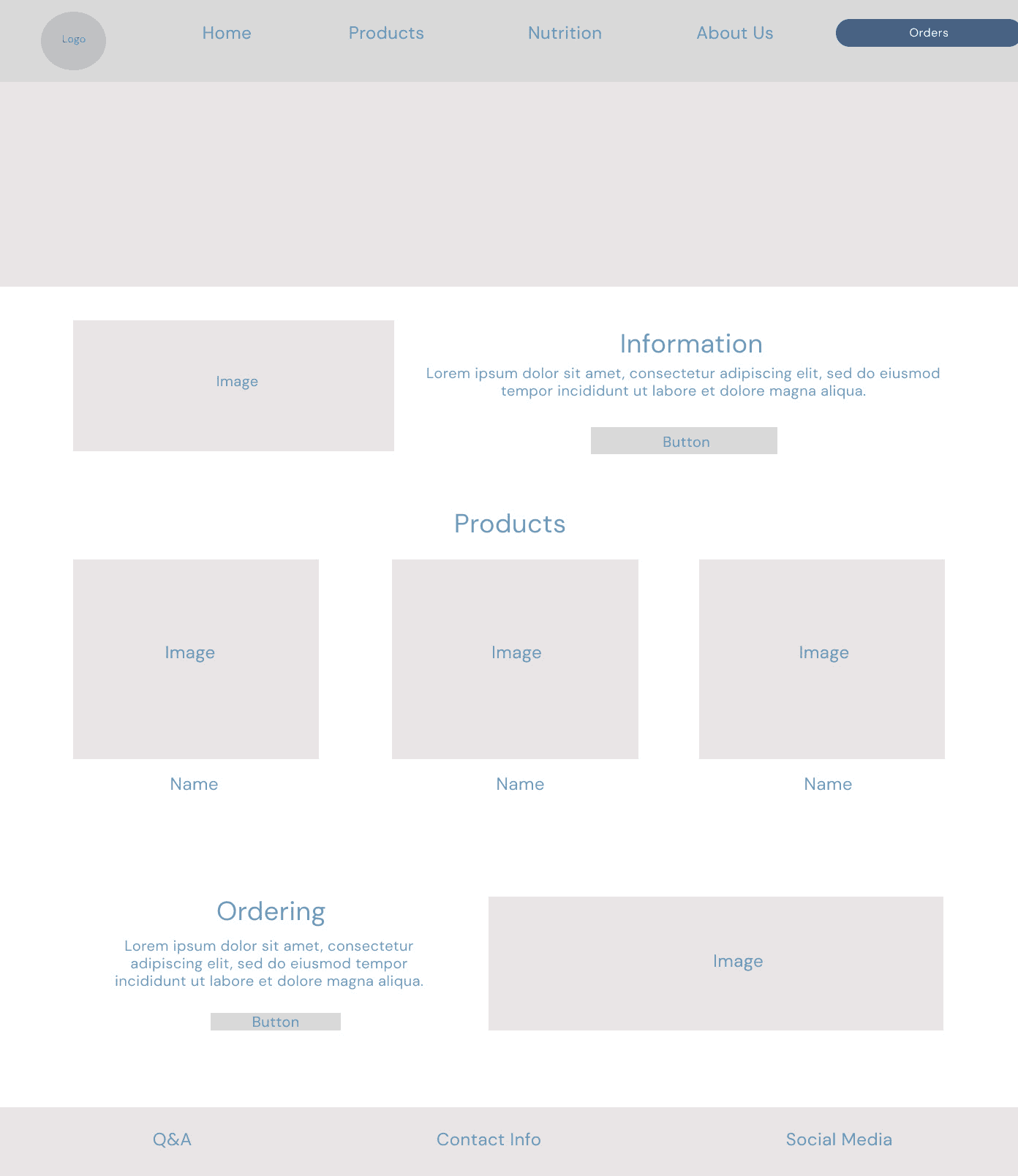
Wireframes
Homepage
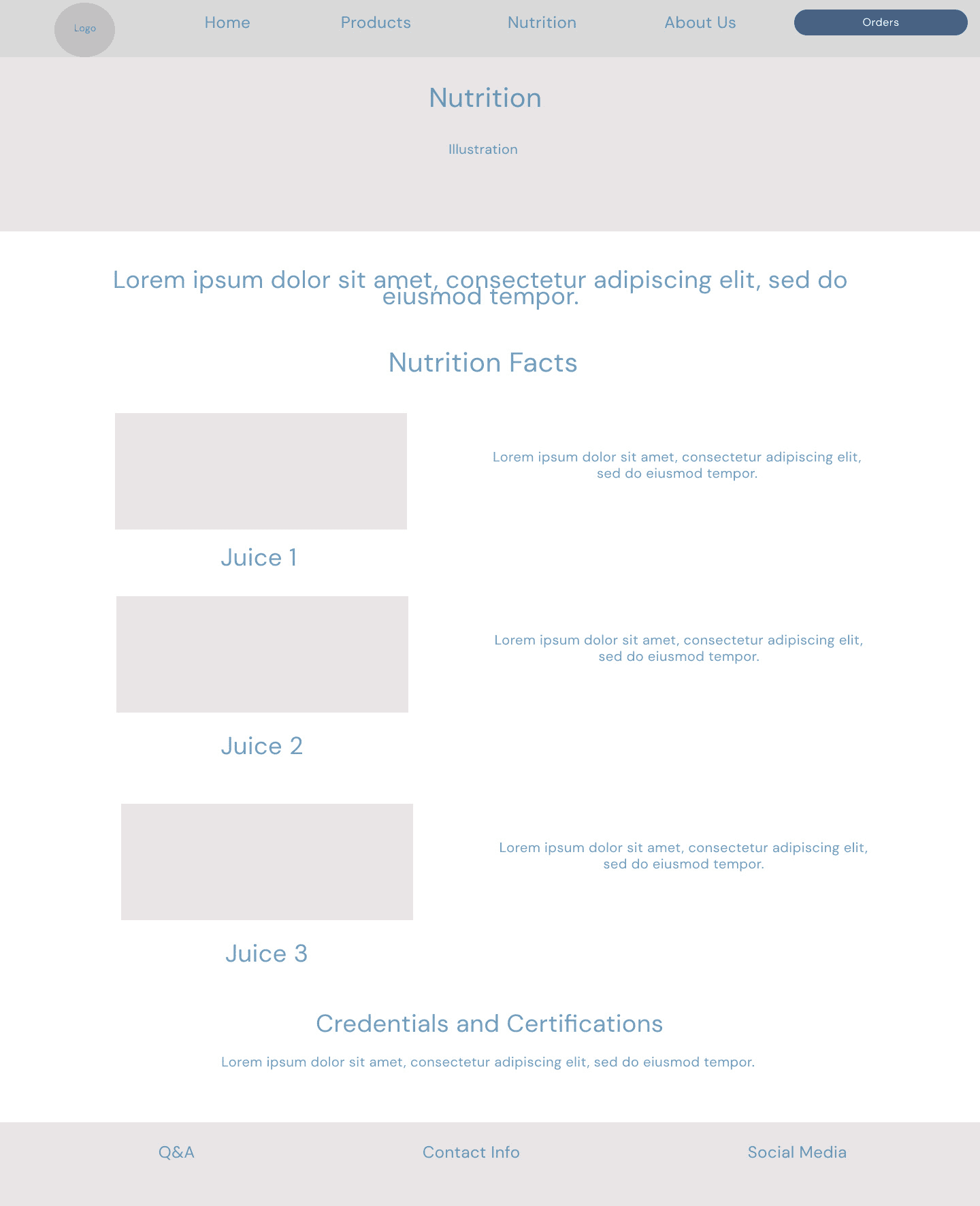
Nutrition Page
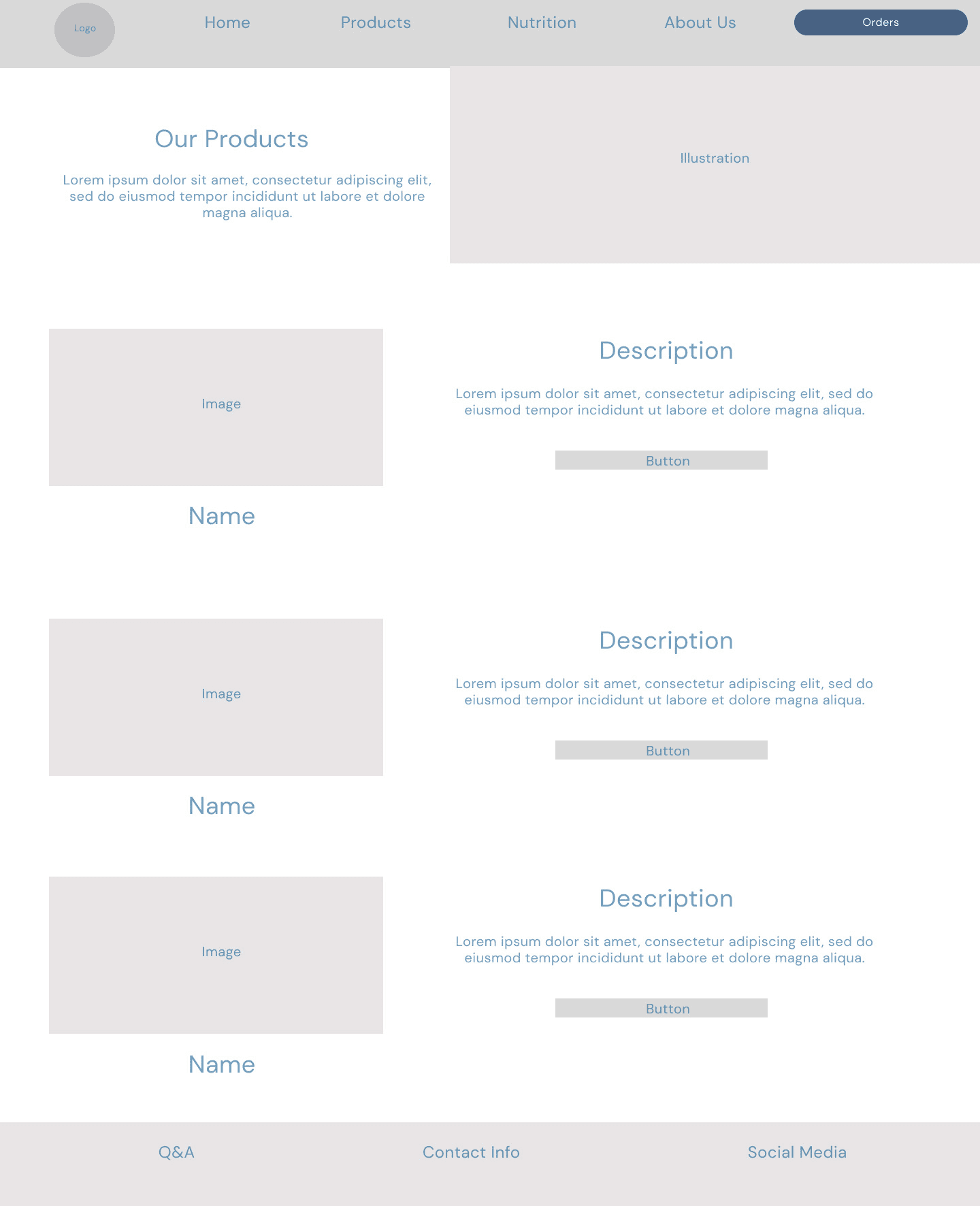
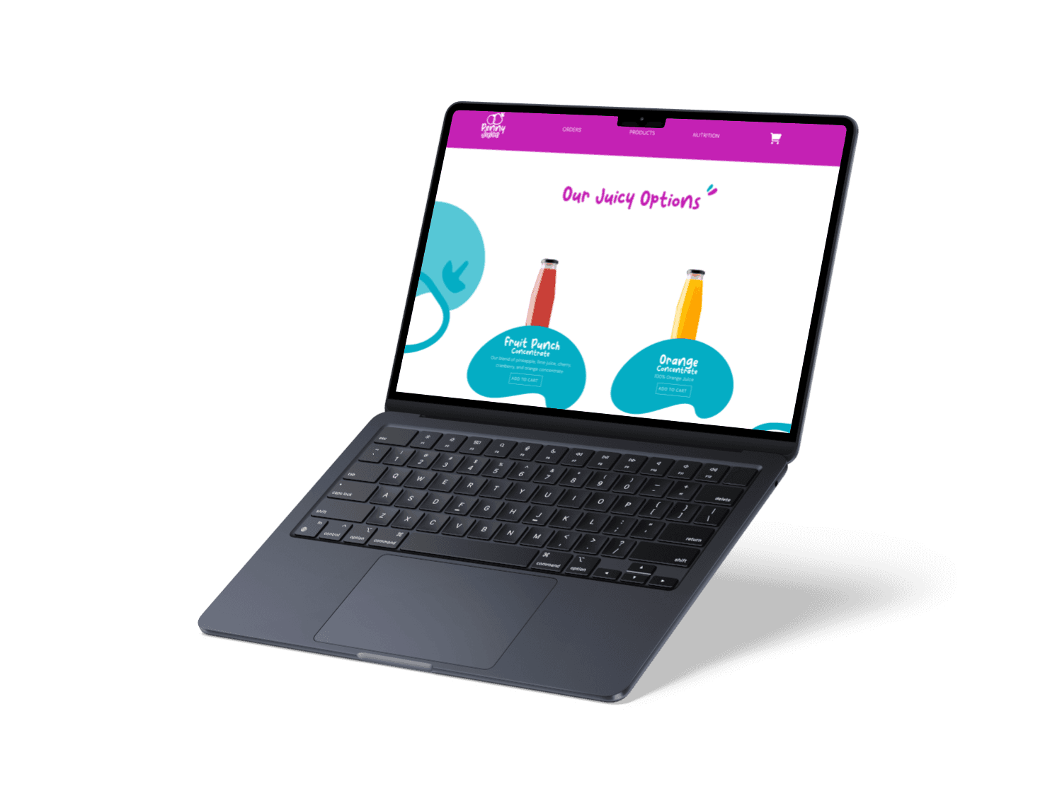
Products Page
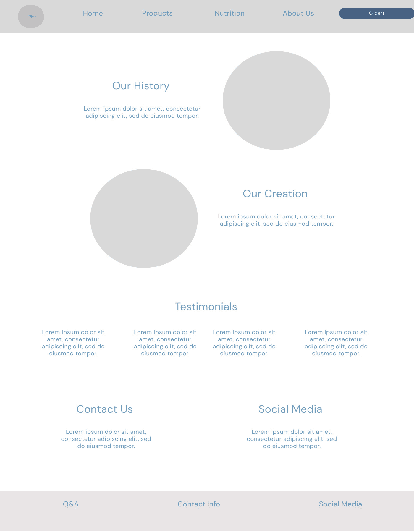
About Page
#C421B4
#04ADC4
Branding
Color Styles
Typography
Buttons & Icons
Brand Elements
Pulang
DM SANS
Heading 80pt
Subheading 62pt
Body 22pt
Michelle Candurin
2024
MICHELLE
CANDURIN
DESIGNER
Case Study
UX Research
Branding
Web Design
Prototype
Penny Juice is in need of a complete rebrand. This rebrand, will include
a new logo, website and brand identity of Penny Juice. The success of this project will be measured by the number of sales that this new look will bring to the company. To achieve this, the website needs to be straightforward, and easy to navigate for new and existing customers.
Penny Juice is a family-owned business, based in Davenport, Iowa, that produces and sells juice concentrate. They mainly focus on selling concentrates in large quantities to daycare and childcare facilities. Penny Juice has been struggling to get more online orders, and reach new clients. Some of their existing clientele thinks that the reason for this, is their current website.
Penny Juice is in need of a new website that will capture the broad audience of children and parents alike. This is why, Penny Juice's site needs to be colorful and vibrant. Also, Penny Juice needs a site that is more straightforward with the process of ordering a product from this store. This process needs to be updated to better the user experience.
Design Process
7 Days
Phase 1
Research
Clients and Users
Solution
6 Days
Phase 2
Concept Development
User Personas & Flows
Wireframes
10 Days
Phase 3
Hi-Fi Wireframes
Prototyping
Branding Style Guide
Pain Points
Penny Juice uses four different colors, that do not match together. This makes the user uneasy, and unable to focus on
the content.
The white transparent box, is unnecessary. This box might
confuse the user, since it seems like it is being unintentionally highlighted.
The “Rainbow” concept is hard to read, and outdated. A bolder, and single color header would make the sentence easier to read.
Text inside the button is difficult to read. Making the button a neutral color, and the text bigger would improve the probabilities of the user clicking on it.
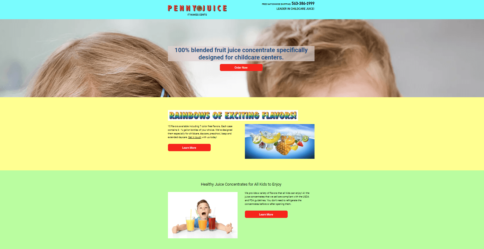
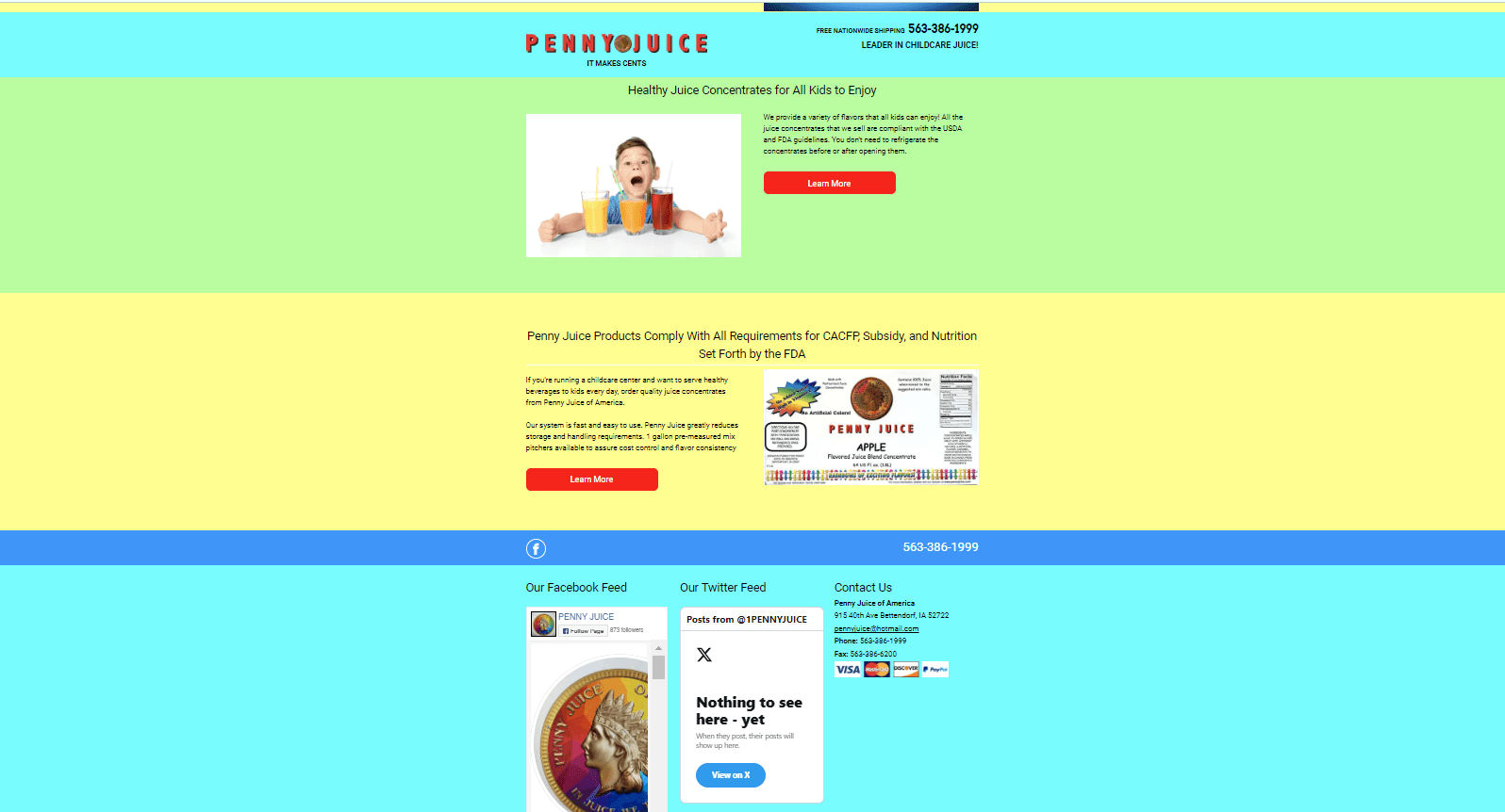
The navigation bar stays in place while scrolling, which hides some of the page’s content. It also does not look appealing to the user. The navigation bar should stay at the top of the page.
Using social media plug ins takes away from the website design. These should be eliminated and replaced with icons.
Penny Juice does not give the user any context, and does not have any subcategories for the user to know what steps to take. The use of a navigation bar with different pages would better the user experience
LEARN MORE
SUBMIT
